The art of typography
- July 24, 2018
- Author: Beth Harris
- Category: Branding, Communication, Creative, Design

I love fonts. It’s an obsession really. I’m a typophile (https://www.merriam-webster.com/dictionary/typophile) to my core. Being a professional designer for nearly 20 years, I’ve seen an evolution in typography. Gone are the days of just a few simple choices – today, your options are seemingly endless. It’s still true, though, that the typography you choose can make or break the perception of your brand.
For true typophiles, there is a technical difference between typeface and font. But for purposes of this post, we will use the terms interchangeably.

Top three things to consider when choosing typography
- Readable and legible
Just because a font is visually interesting, doesn’t mean it will work in every circumstance. Keep in mind how and where the font will be used. Will it work in a small format like a business card? Will it work in a large format like a building sign? And how will it look in different colors? First and foremost, people need to be able to read and understand your message, no matter where it appears. It’s important to choose typefaces that are both readable (it’s easy to understand blocks of text) and legible (it’s easy to distinguish one letter from the next).
- Recognizable and relatable
When choosing a font for your brand, it’s important that the look and feel of the typeface matches the look and feel your company wants to portray. If you own an auto body shop, choosing a script font with swirls and loops may not be right for your brand. Consider the message you are trying to send and find a font that matches it. You also want to make sure the typography you choose, or the way you use it, is unique, memorable and consistent so that your clients know your brand on sight.
- Agreeable and controllable
In the case of typography, more is not better. We recommend choosing two or three fonts that work well together and then using them in an intentional and restrained way. Mixing too many fonts can be distracting and confusing and can also dilute your brand aesthetic. To ensure the fonts you pick complement each other, you can start by visiting font pairing sites like Fontpair, Typio and Canva. (https://fontpair.co/, http://typ.io/, https://www.canva.com/learn/the-ultimate-guide-to-font-pairing/) to get an idea of what’s available and what you find attractive.
Finding fonts can be lots of fun – and sometimes frustrating. If you find the options are a bit overwhelming, you may wish to consult a professional designer who can help you choose the perfect typography for your brand.
If you are intrigued, here’s a good resource:
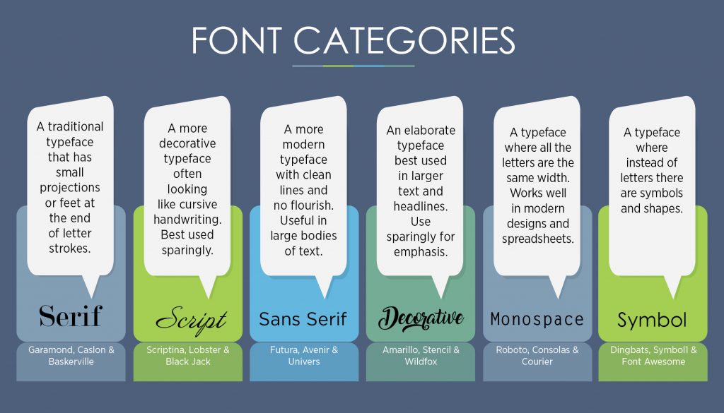
https://www.fonts.com/content/learning/fontology/level-1/type-anatomy/type-classifications
If you want to geek out on fonts, get in touch!
