Quick tips for more effective web ads
- July 14, 2016
- Author: Jim Sleeper
- Category: Communication, Creative, Digital

Are you interested in driving more traffic to your website? Of course you are. A well-designed and well-placed web ad can help.
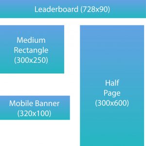
Web ads come in lots of different shapes and sizes, with banner ads being the most popular. Typical sizes include the leaderboard (728 pixels wide x 90 pixels tall), medium rectangle (300 pixels wide x 250 pixels tall), half page (300 pixels wide x 600 pixels tall) and mobile banner (320 pixels wide x 100 pixels tall).

Here are a few things to consider as you develop or update your web ad campaign:
Call to action (CTA) – This is one thing that never changes. Give a viewer of your web ad a good reason to respond. A clear call to action will give viewers a reason to click your ad.
Simple is usually better – Or some might say, “Less is more.” Don’t cram lots of information into your ad. Don’t make the viewer work to figure out what your message is about. Get to the point right away.
Color – If your brand has specific colors, stick with them. Two-color designs (duotone) with contrasting colors make for a striking visual.
Animation – When done well, animation can enhance your web ad. Our eyes like movement. Done poorly, it can distract viewers from your ad’s message. Moderation is the key here.
Hero images – A striking image will catch a viewer’s attention. It could be a super-macro close-up or a beautiful vista.
Stock photography/icons – Many ads use images and icons from stock art vendors. For your ad’s images, consider using photos, illustrations and icons that you personally developed.
Placement – Carefully research where your web ad campaign would be most effective. Keep up with the statistics your campaign generates, and consider updating your ads periodically to keep your campaign fresh.
It’s all about good communication. Consider an update for your web ad campaign and drive more traffic to your website.
