Building effective newsletters
- August 9, 2017
- Author: Rachel Sheffield
- Category: Digital, Newsletter

You’ve built your website, now what? You need to drive traffic there so you can generate leads, collect email addresses, update visitors on company news, or share educational information. An e-newsletter may be the best solution. Emails have been shown to be successful in gaining new readers and clients. In 2016, eMarketer reported that email’s return-on-investment (ROI) outperformed all other digital marketing tactics, including social media.
There are six things to consider when building your newsletter:
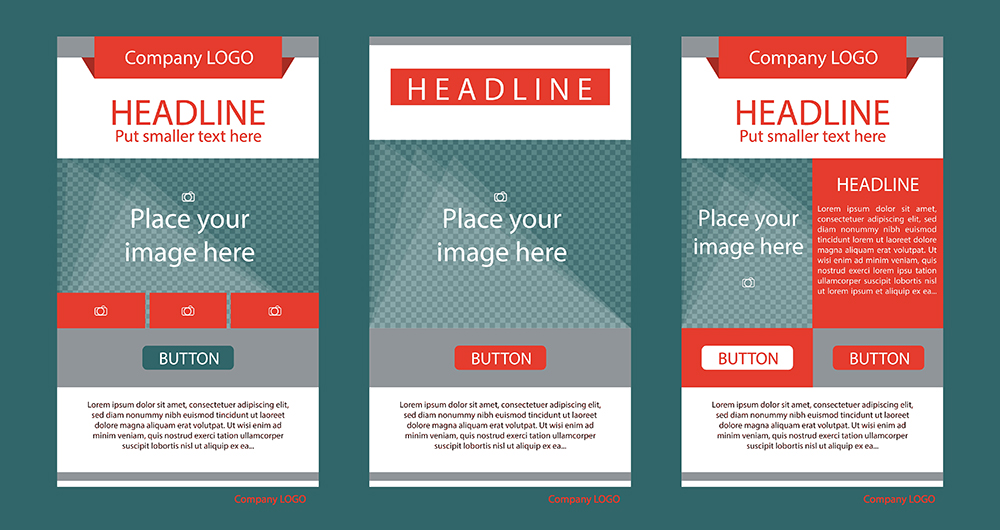
- Content. Will it feature one main story and a call-to-action (CTA)? Will it present multiple articles and a list of upcoming events? It is most efficient to create a template once you know what content is going in it. You could build a very basic layout, but more than likely you’ll have to rework it once you do decide on text and images. This can result in wasted time (and money). Plan your newsletter content so you’re able to successfully design around it.
- Branding. If your company has a specific logo, brand colors, and font in place, use them! With our recent redesign of the Cary Magazine website, we took the opportunity to redesign the newsletter, and many of the branding elements found in the website also appear in the email design. For instance:

- The CM logo is prominently displayed in the newsletter’s header.
- The gold color is used to make clickable buttons and links more noticeable.
- The heading font on the website is mirrored in the heading font in the email.
All these things make the newsletter look like it belongs with the website. (Note: When using web fonts, keep in mind that some email applications that don’t support them. You can either use an image of the text, or use a web safe font that closely resembles the text. You should avoid putting important text into your email as an image because images do not display 100 percent of the time.)
- Mobile. Consider these statistics:
Mobile email opens have grown by 180 percent in the last three years. (emailmonday)
In 2016, 54 percent of emails were opened on mobile devices. (litmus)
By 2018, 8 in 10 email users will likely access their email accounts exclusively from their mobile devices. (emailmonday)
For all these reasons, it is imperative that your email works on smartphones. Some actions you can take to create a responsive email:
- Use a one or two column design. Ideally, find a template that is responsive and alter it for your needs. These frameworks can create emails that are multiple columns on desktop, but one column when viewed on a mobile device. Zurb offers many free responsive templates.
- Include only vital information. Don’t include so much text that a user must scroll forever trying to find the information that matters. Keep your focus narrow, and limit the number of CTA. Your goal is likely to get people to sign up for an event, continue reading a story, or request more information; so respect their time by being clear and concise.
- Create big buttons so they are easy to see and click, and make sure there is enough space around the buttons so that clicks are intentional, not accidental.
- Include ample white space to give readers’ eyes some relief.
- Refrain from stuffing the newsletter with large images that slow loading times.
- Compliance. You MUST include an unsubscribe link in your newsletter. The link must be easy to find and easy to understand. Other rules include using accurate header information (the “From,” “To,” and “Reply-To” fields), using honest subject lines, and being transparent about your location. Not following these regulations can result in hefty fines. You can read more about these regulations on the Federal Trade Commission’s website.
- Testing. Before sending your newsletter out into the wild, you should test it first. Not all email applications are the same. Gmail can render emails differently than Outlook; in fact, Gmail on an Android phone can render emails differently from Gmail on an iPhone! Test on different devices with different email applications to ensure that your email will be viewed correctly.
- Analyzing. After you’ve sent your newsletter out, be sure to take advantage of any analytics tool you may have so you can determine what is working and what isn’t. You may also want to try A/B testing (but that is another blog post!).
When you decide to take the plunge and design a newsletter email, you may want to consider using pre-made templates and customizing it for your needs. There are many free pre-made templates out there, and many email marketing services like Listrak, MailChimp, or Constant Contact provide templates as well. If you want a custom-made template, but lack the resources to create it, contact us for assistance.

